


Watchers 5
ibdoofus
objectionform
m13slash9
dirtydollbaby
s-w-a-n-i-e
SennhArt
Doringota
MonikaLoesser
Gunsexy
SteampunkForever
elenaevil
IndustrialArt
Steampunk-Artists
StudioMC
aka-photography-uk
NinaMierowska
AncillaTilia
Felynx-x
Kurumii-chan
Skyclad-est-Darkclad
Collection
Favourites


frank-e-ninn is not a Group Admin yet
Groups they admin or create will appear here
Artist // Hobbyist // Digital Art
- Sep 8
- United States
- Deviant for 13 years
- www.ogrexx.com
- He / Him
Badges

My Bio
... author/artist of ögrëxx ... a graphic drabble and webcomic.
... dang
0 min read
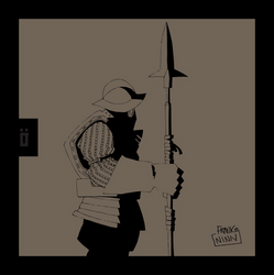
... i've changed directions ... ögrëxx was going to be quite dark and hateful ... i don't want to go that route anymore. i'm thinking of exploring two different settings for the story ... steampunk or 'dungeons & dragons'-ish ... leaning towards steampunk which will be more challenging as steampunk seems to require extensive detail and mechanical imagination.
... i'm also thinking of adding a bit of a super natural element to the story ... psionics. although, i always want to stay away from clichés: sword-weilding and martial arts ... vengeful heroine who suffered a tragic loss in life ... ultra-evil villains ... i can go
Join the community to add your comment. Already a deviant? Log In
converted my website
0 min read
... changed my website colors to black background, inverse text: http://www.ogrexx.com/
... the black background is definitely better than the white, however, i'm now questioning the site layout ... i liked the simplicity of this wordpress theme, however, i'm not sure it's conducive to reading/viewing it as a complete drabble ... the way it is now, you have to view the illustration first and then read what it's about ... it's abrupt and if people aren't familiar with drabbles, this could be confusing to know that that text is part of the art.
... i may take a look at comic press wordpress theme and see if i can work with a horizontal format
Join the community to add your comment. Already a deviant? Log In
another drabble done
0 min read
... eh, this one was OK: http://www.ogrexx.com/acolyte/
... overall, it's good ... i've added action instead of it being after-the-fact like previous pieces.
... the drawing has some errors in it. oh well. i don't have a ton of time to do these ... at least it's done. it's late. should have had this done on sunday. need to catch up. need to add some more sketches to da.
... going to work on something 'darker' ... more dark than light ... we'll see how it goes.
... not sure if the white background website is doing my drabbles justice. it's clean, simple, but the white right now doesn't seem to be working for me. wonder if i can alter style
Join the community to add your comment. Already a deviant? Log In
Profile Comments 2
Join the community to add your comment. Already a deviant? Log In
Thanks for watch!!!!!!
... yep.